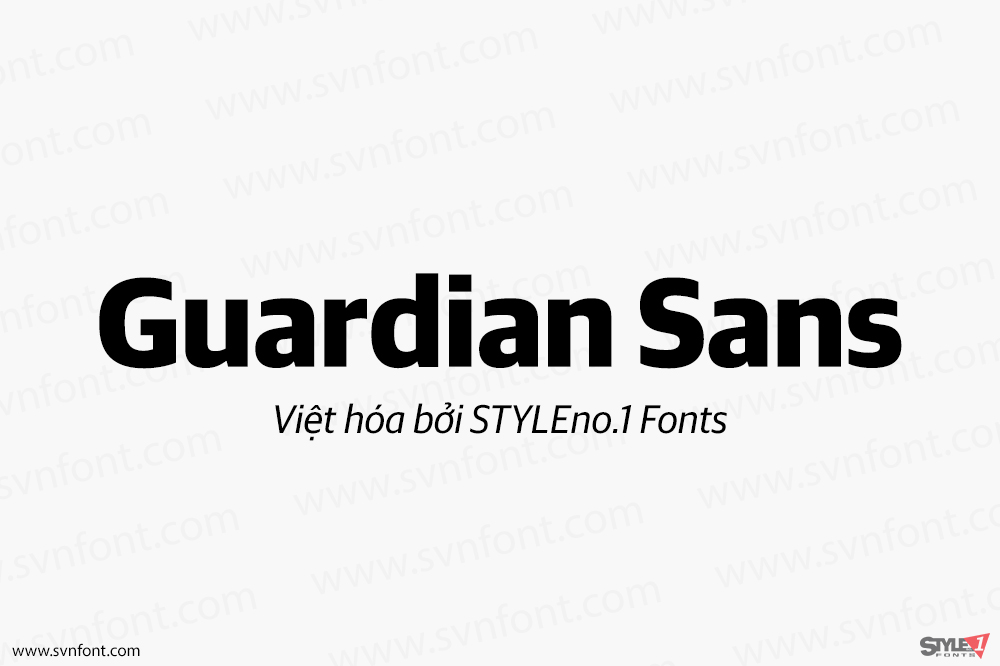
Sans-serif
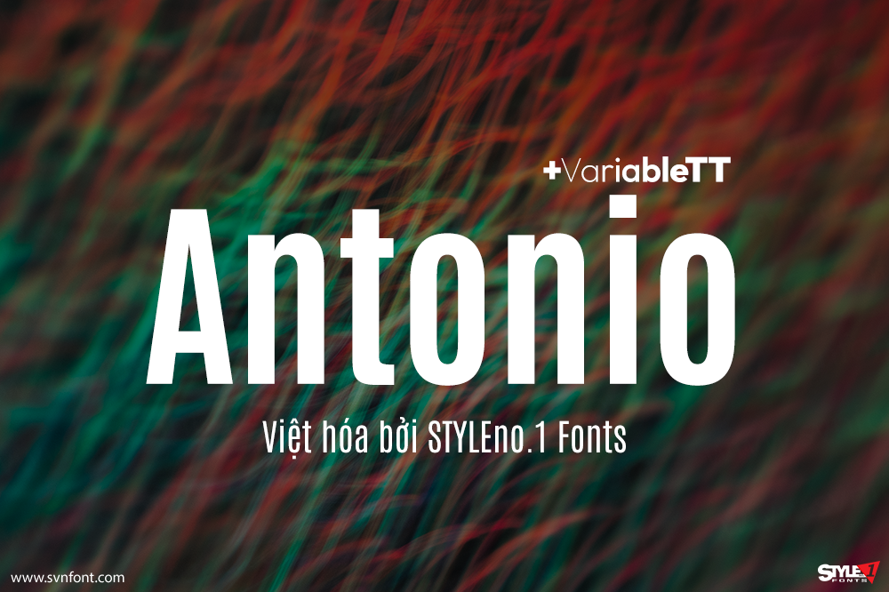
[Việt hóa] SVN-Antonio (7 fonts) + Variable
Antonio is a 'refined' version of the Anton Font. Anton is a single weight web font, designed specifically for larger display, headline and 'banner' use...
Đọc tiếp...
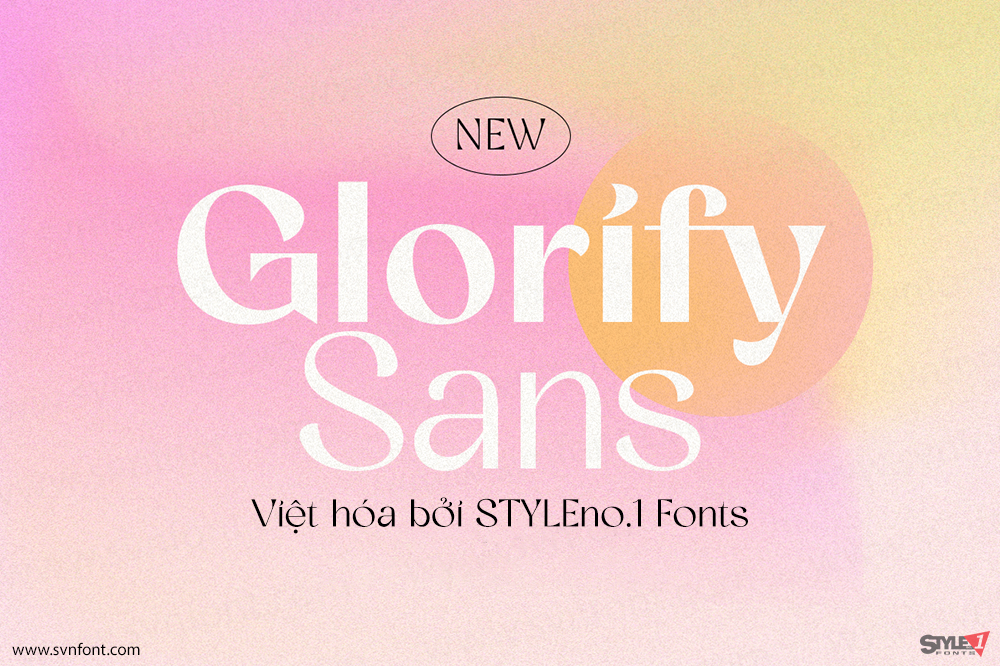
[Việt hóa] SVN-Glorify Sans (8 fonts)
lorify Sans is a sophisticated sans serif with many weight style to choose from. You will get 8 weight styles which you can play around...
Đọc tiếp...
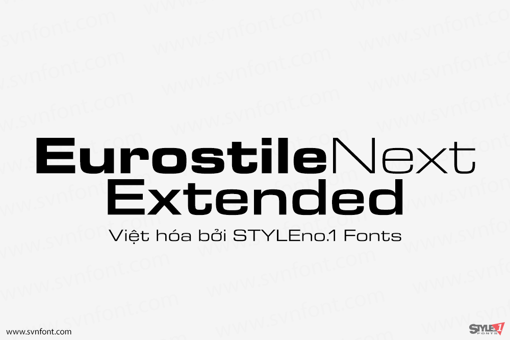
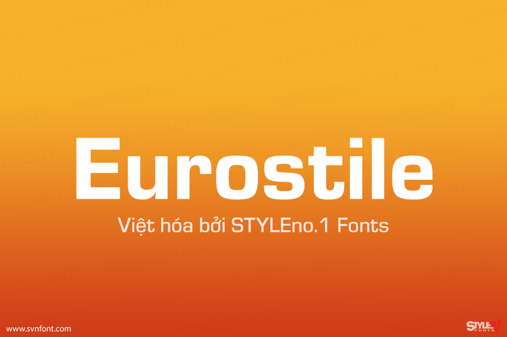
[Việt hóa] SVN-Eurostile Next Extended (10 fonts)
Eurostile Next is Linotype's redrawn and expanded version of Aldo Novarese's 1962 design. This new version refers back to the original metal types and to...
Đọc tiếp...
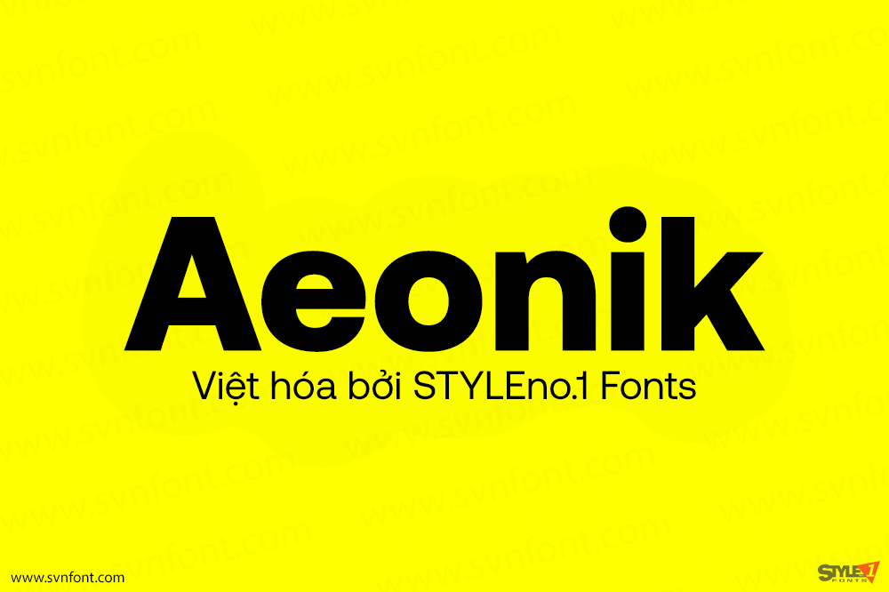
[Việt hóa] SVN-Aeonik (14 fonts)
Aeonik: a structural workhorse, crafted with mechanical detail. Conceived as a ‘neo-grotesque with a geometric skeleton’ Aeonik holds rigidity and coldness through strict perpendicular terminals:...
Đọc tiếp...
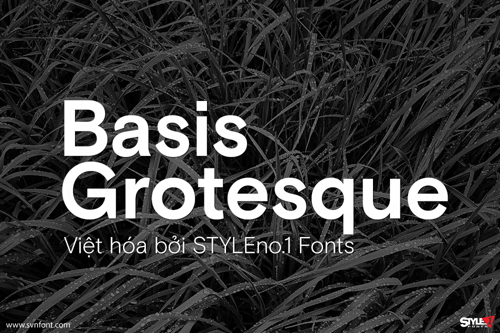
[Việt hóa] SVN-Basis Grotesque (12 fonts)
Originally drawn in a Regular weight for the comprehensive re-design of photography magazine HOTSHOE, we are pleased to release BASIS GROTESQUE commercially, some three years...
Đọc tiếp...
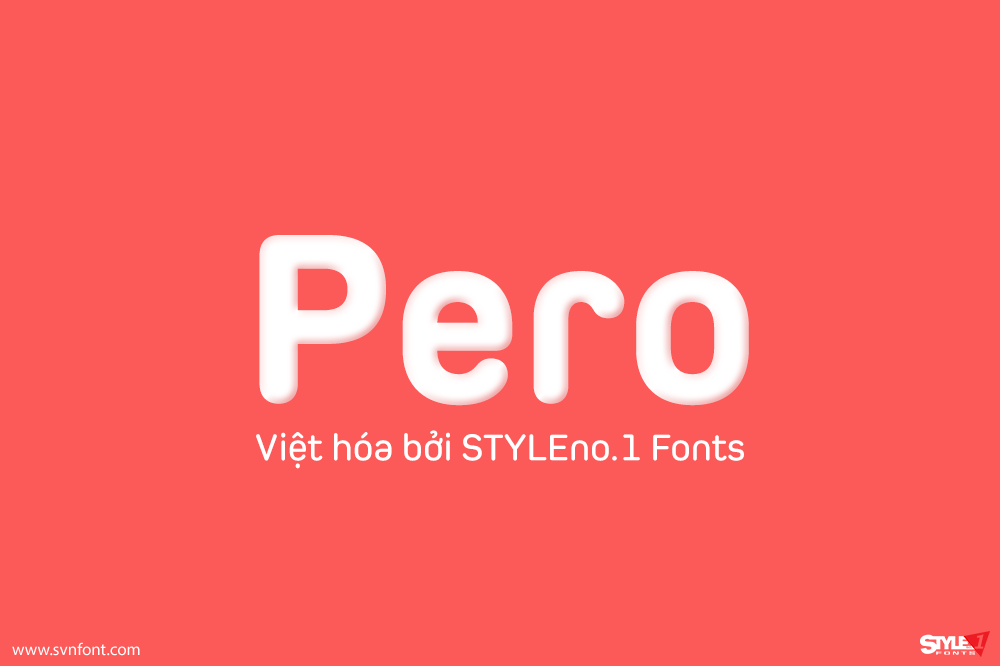
[Việt hóa] SVN-Pero (7 fonts)
Pero is a condensed rounded sans-serif family designed by Ryoichi Tsunekawa and the whole family consists of 7 weights from ExtraLight to ExtraBold.The range of...
Đọc tiếp...
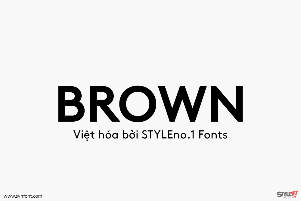
[Việt hóa] SVN-Brown (8 fonts)
LL Brown owes much to the groundbreaking work of both Edward Johnston and Arno Drescher, whose respective designs – Johnston Sans (1916), and Super Grotesk...
Đọc tiếp...
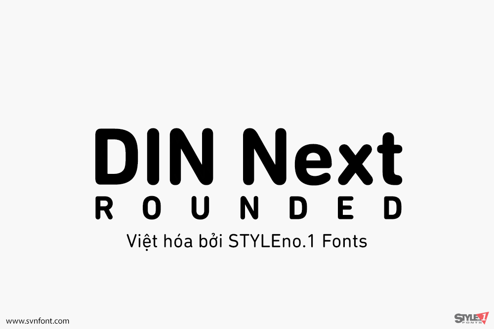
[Việt hóa] SVN-DIN Next Rounded (4 fonts)
The name DIN refers to the Deutsches Institut für Normung (in English, the German Institute for Standardization). The typeface began life as the DIN Institute's...
Đọc tiếp...
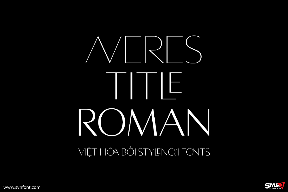
[Việt hóa] SVN-Averes Title Roman (3 fonts)
Averes Title Roman is a high contrast sans titling typeface available in three weights. It features an array of stylistic discretionary ligatures with corresponding accented...
Đọc tiếp...
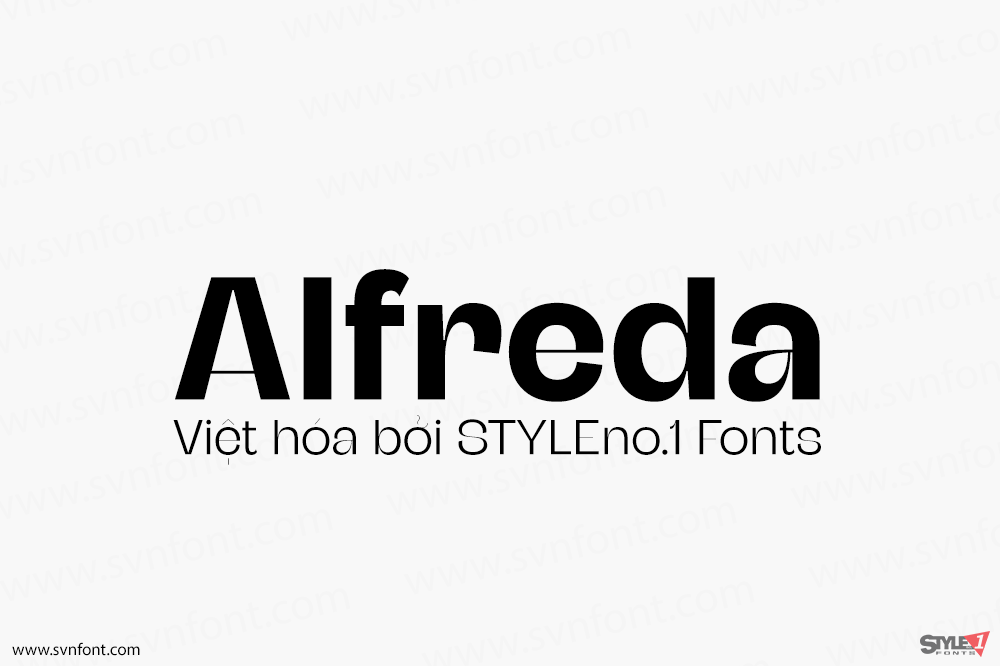
[Việt hóa] SVN-Alfreda (6 fonts)
Alfreda grotesque is not just another grotesque typeface. Its morphology mixes modulated and unmodulated strokes, and natural and reverse contrast. All that with a humanistic...
Đọc tiếp...