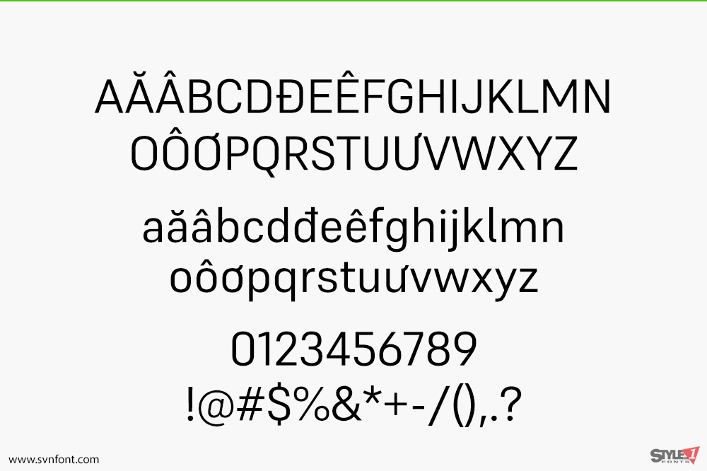
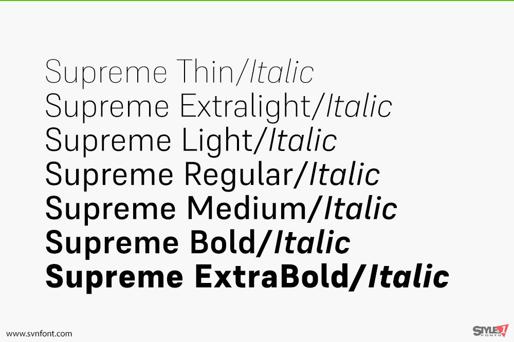
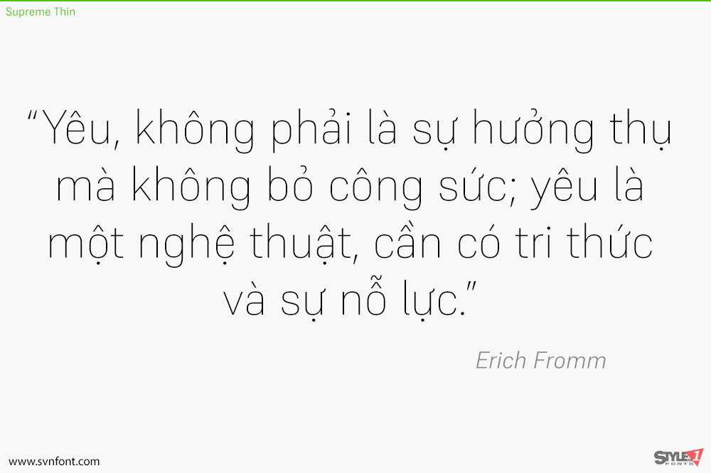
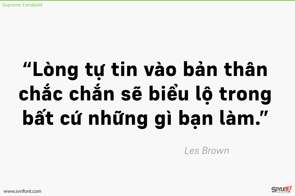
Supreme is a large family of constructed-style sans serif fonts. These fonts feature forms that look like those that have been favored by engineers for over a century. Their letters are straight-sided, and the strokes that make them up are monolinear. The Supreme family includes 14 members. Seven of these fonts are italics, although these italic fonts should really be called ‘obliques,’ as the letters are slanted versions of what you’ll find in the upright fonts. The family’s weights range from Extralight through Extrabold. The x-height is moderate, so the ascenders and the descenders are quite prominent. The ascenders rise above the capital letters and the numerals – both of which share the same height. Each font uses a double-storey ‘a’ and single-storey ‘g’. Years ago, fonts like Supreme were primarily used to brand firms in engineering and tech. Recently, however, they have become increasingly popular solutions for setting text on screen. The Regular weight of this family would be excellent for setting body copy either on screen or in print. The other weights can be used for text sizes, too, but will function even better when used large. Supreme was designed by Jeremie Hornus and Ilya Naumoff.
Nhà thiết kế: Jérémie Hornus, Ilya Naumoff
Nhà phát hành: Indian Type Foundry
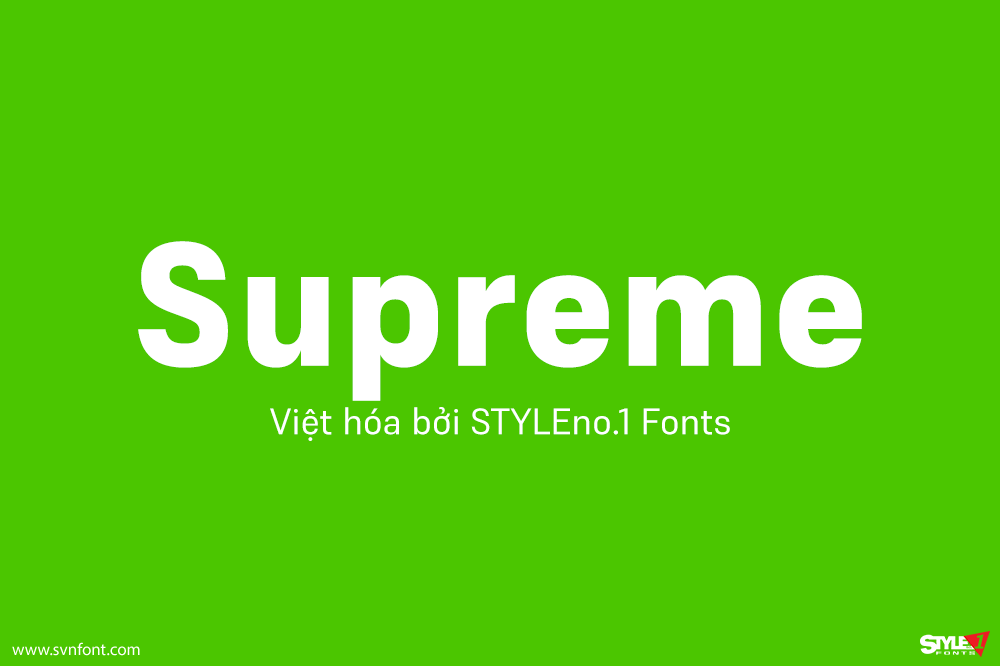
Việt hóa: STYLEno.1 Fonts
Bản gốc miễn phí cho mọi mục đích sử dụng, từ Fontshare.com
Bản Việt hóa cung cấp cho mọi mục đích sử dụng dưới hình thức trả phí.
![]()