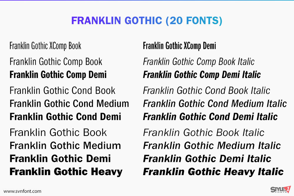
The ITC Franklin Gothic™ family embodies true American grit: it’s square-jawed and strong-armed, yet soft-spoken. If Bruce Springsteen were a typeface, he would be ITC Franklin Gothic. The family suite of typefaces is large and adaptable – and is as well-suited to web content and small screens, as it is to billboards and hard copy display ads.
The ITC Franklin Gothic is a reimagining of Franklin Gothic, a design that dates back to 1902. It retains the personality and character of the original typeface, with only a slight increase in x-height and character width to distinguish it from the first version. Although newer typeface families such as Helvetica®, Univers® and Frutiger® have the same basic proportions and attributes as Franklin Gothic, the similarity ends there. ITC Franklin Gothic retains all the strength and vitality typical of early American sans serif typefaces.
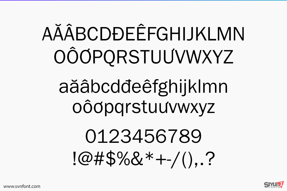
Capitals are wide (typographers would call them “square”), lowercase letters share the proportions and letter shapes of serif typefaces – and character stroke weights echo the serif-styled counterparts in that they have an obvious contrast. For example, the left side of the A is lighter than the right, and the first stroke of the M is lighter than the other three.
While ITC Franklin Gothic is essentially a display design intended for larger size settings, it’s also easy on the eyes in short blocks of text copy. A natural for interactive design, it will bring a subtle, handcrafted quality to pages and screens. Combine ITC Franklin Gothic with an old style or slab serif typeface and you’ll have copy that’s inviting and classic as an old pair of jeans.
Nhà thiết kế: Morris Benton, Victor Caruso
Nhà phát hành: ITC
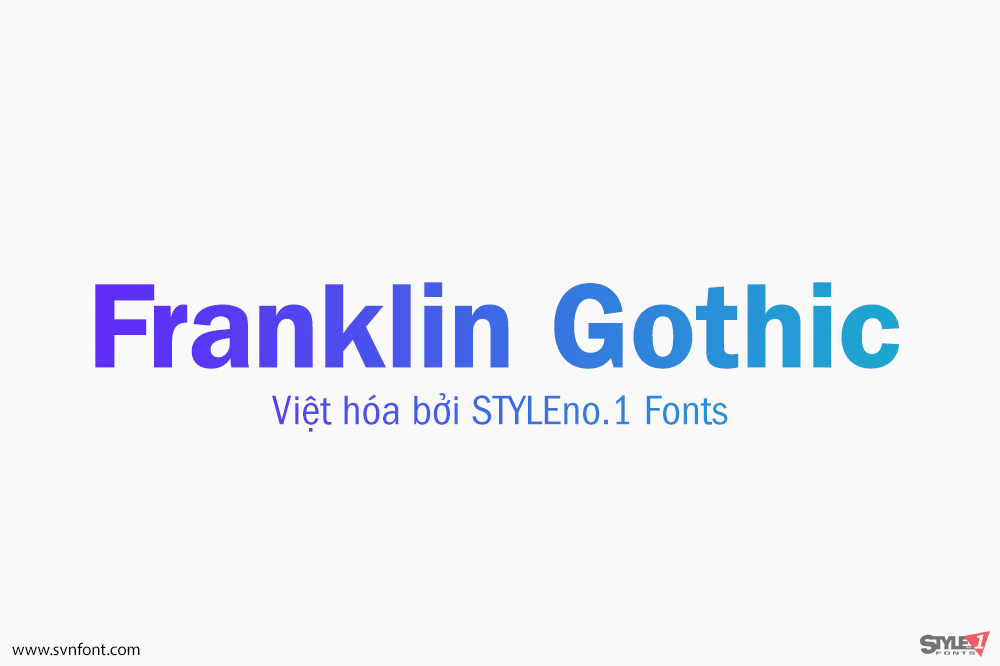
Việt hóa: STYLEno.1 Fonts
Mua bản gốc trước khi sử dụng từ Myfonts
Bản Việt hóa cung cấp cho mục đích sử dụng cá nhân dưới hình thức trả phí.

![]()