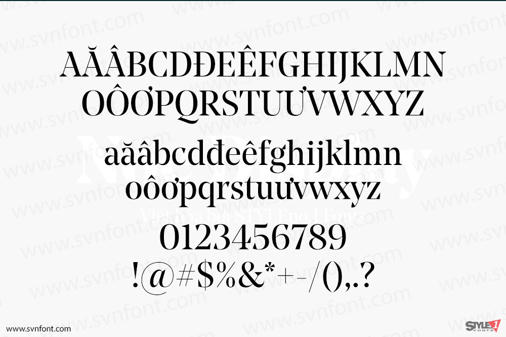
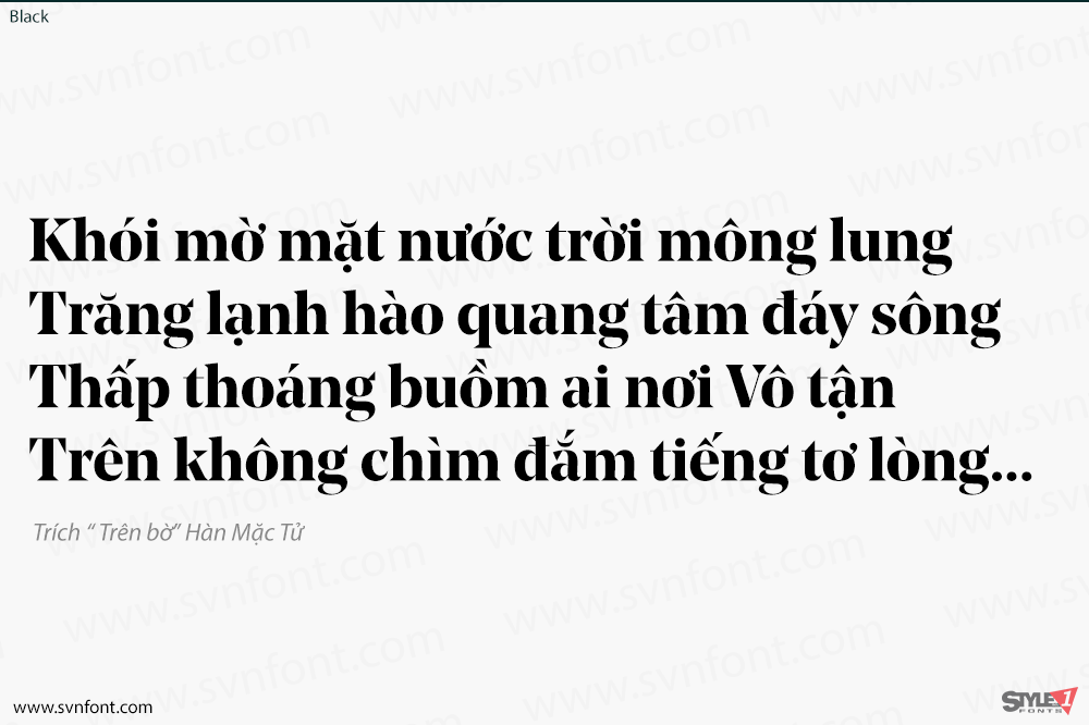
What makes Noe unique is the audacious way its strokes end. Large, wedge-shaped serifs come to a sharp point. Arches are capped with prominent beaks. Historically, such triangular serifs are associated with the ‘Latin’ genre. Also known in German as ‘Etienne’ or ‘Renaissance’, this genre first blossomed in the 1880s. It shares the formal attributes of older rational romans, including a vertical stress axis and a strong contrast between thicks and thins, but is distinguished by said tapered serifs. Noe adopts these characteristics and remodels them for the 21st century, as exemplified by the large lowercase. The acute triangular terminals add a certain fierceness to the usual elegance of high-contrast serif type, without detracting from its poise and finesse. Slow, round curves enter into a seamless dialog with brisk, spiky terminals. The italic is especially fluid, with a blatantly cursive construction and long, tapering entry and exit strokes.
Nhà thiết kế: Lauri Toikka
Nhà phát hành: schick-toikka
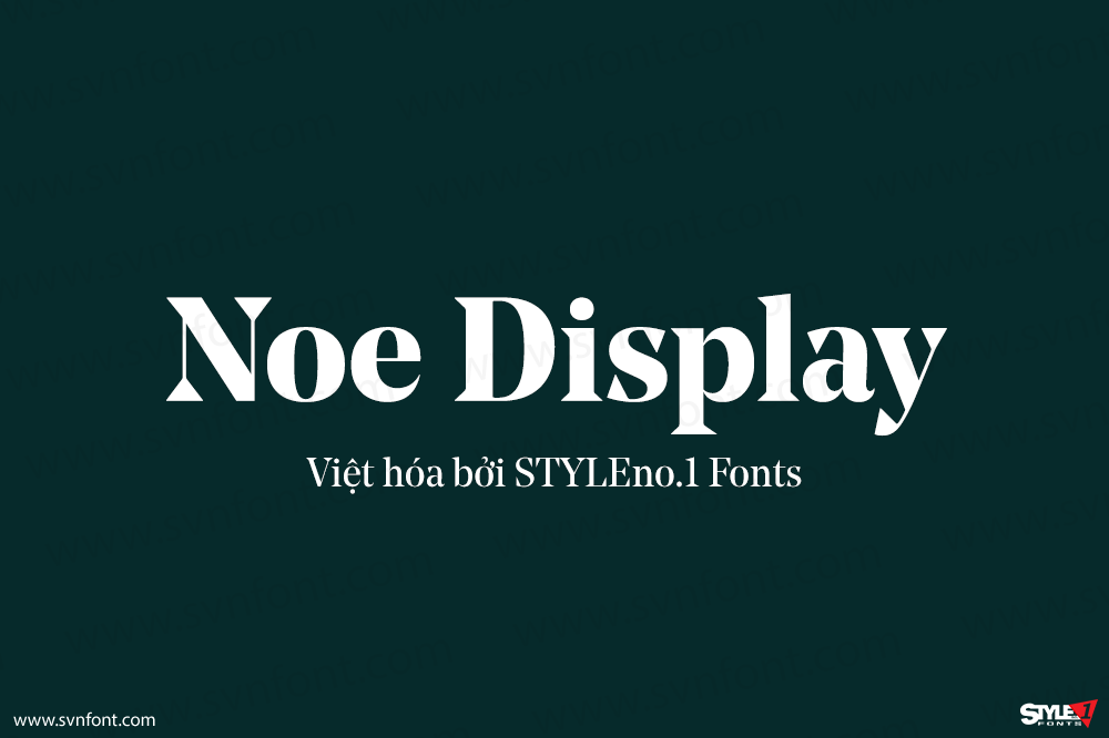
Việt hóa: STYLEno.1 Fonts
Mua bản gốc trước khi sử dụng từ schick-toikka
Bản Việt hóa cung cấp cho mục đích sử dụng cá nhân dưới hình thức trả phí.
![]()