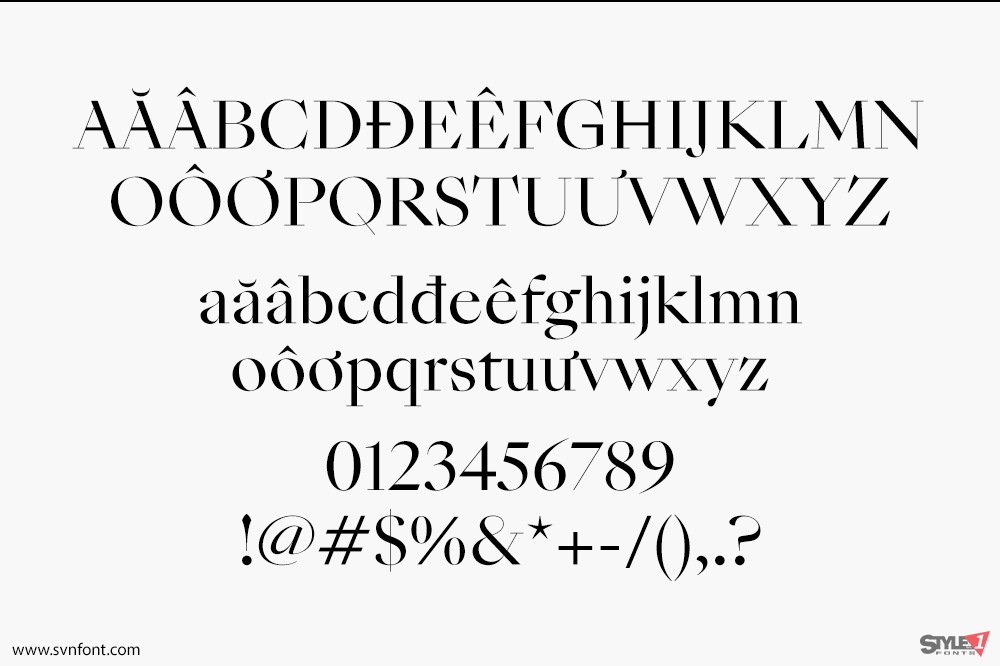
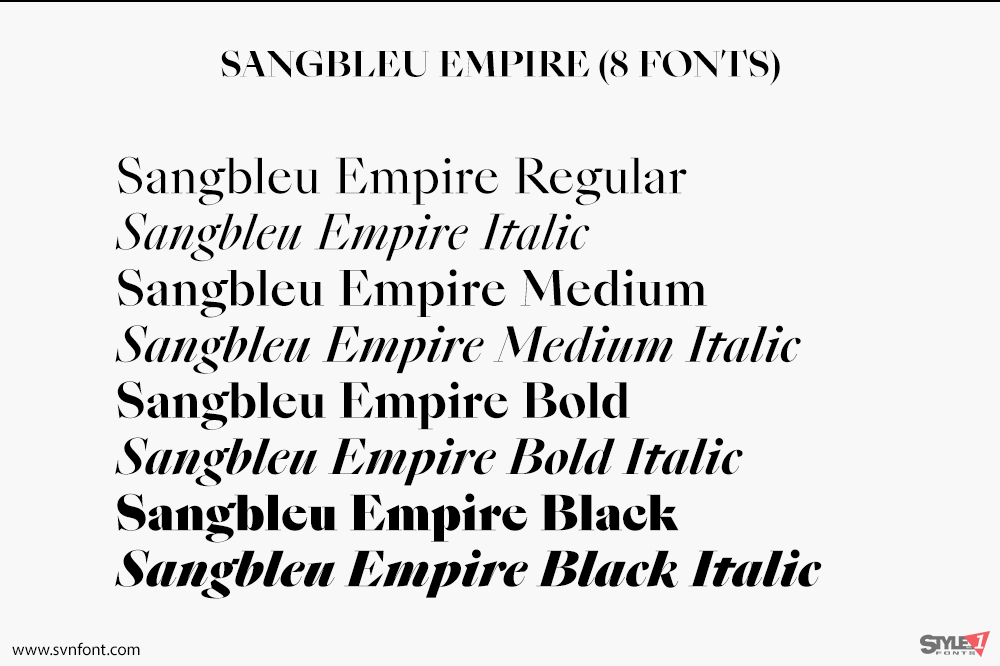
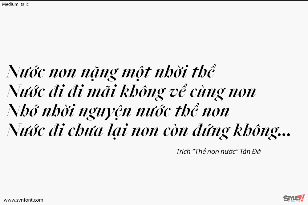
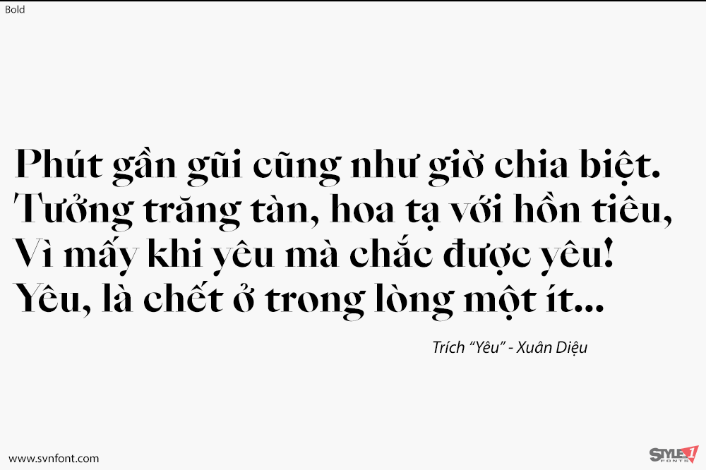
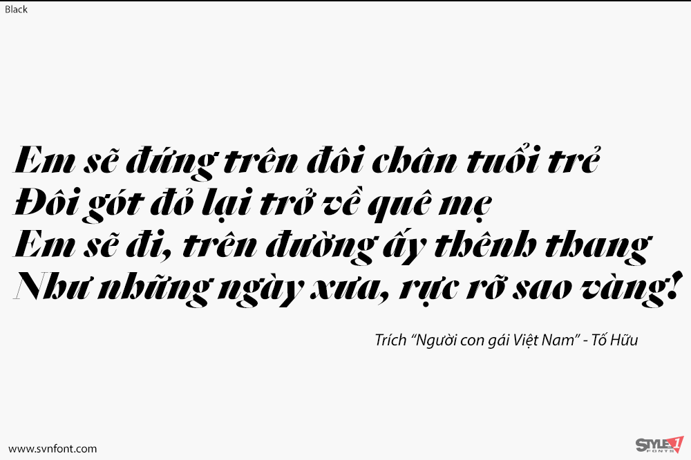
In SangBleu Empire, most serifs are lineal, like in a Didot. The high contrast increases across the four weights. The thick parts grow bolder and bolder, but the hairlines remain razor-thin. Empire ranges at the display end of the typeface: It has the Napoleon syndrome – Empire loves to be big. Also, it is the only SangBleu member to be endowed with Black styles. There, its thick & thin delicacy is taken to the max. Fat curvy letters like the grinning ‘e’ or the spiraling italic ‘w’ may evoke the Caslon burlesques as conceived in NYC’s design studios of the 1970s. But then you encounter the bare kinks and cuts – the crude bar in ‘G’, devoid of any smooth transition, the leg of ‘K’ that has been synthesized into a pure rhomboid, the ‘Q’ that trades the expectable voluptuous tail in for a shockingly plain needle, the italic ‘z’ – and you’ll realize this diva is headed for the future. Some of this attitude is also to be found in our TheW typeface, which may be regarded as a distant cousin.
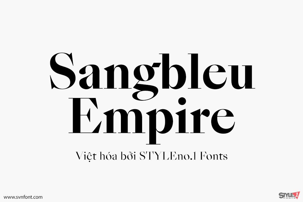
Nhà thiết kế: Swiss Typefaces
Nhà phát hành: Swiss Typefaces
Việt hóa: STYLEno.1 Fonts
Mua bản gốc trước khi sử dụng từ SwissTypeface
Bản Việt hóa cung cấp cho mục đích sử dụng cá nhân dưới hình thức trả phí.
![]()