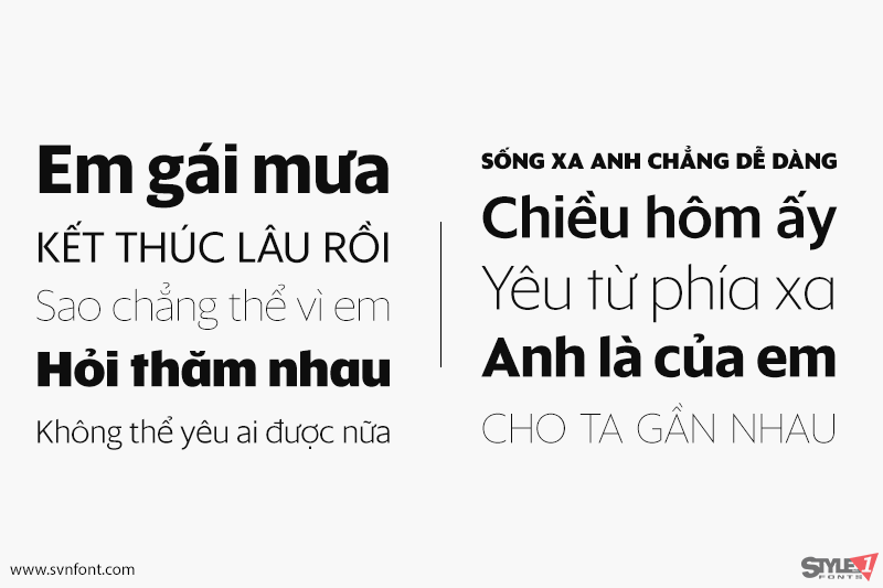
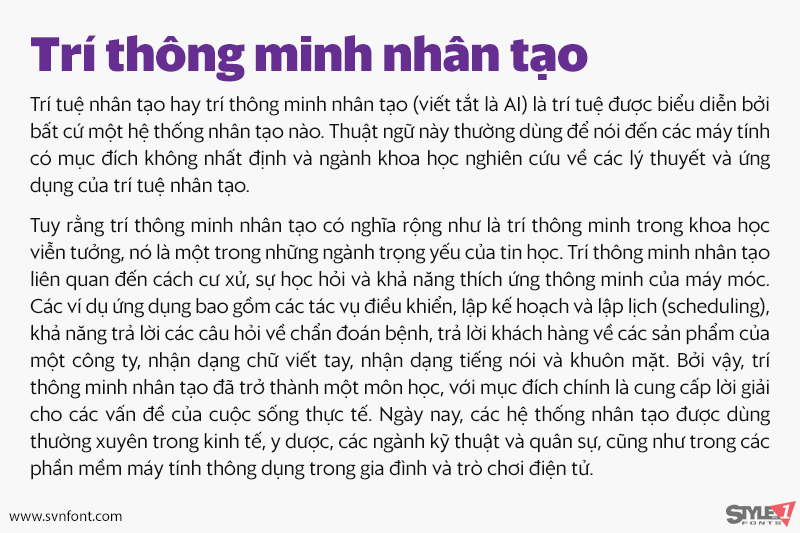
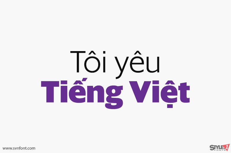
Sanomat Sans is a geometric sans serif with both display and text variants, originally designed for Sami Valtere’s redesign of Helsingin Sanomat, Finland’s most respected national newspaper. A large-format broadsheet since its founding under the name Päivälehti in 1889, the newspaper relaunched in the smaller tabloid format in January 2013. The sharp elegance of Sanomat Sans helped retain the feeling of a quality newspaper in the smaller format, while Sanomat Sans Text is a workhorse, bringing clarity and legibility to smaller sizes. To counter the potentially monotonous texture caused by the many repeating letters in Finnish words, the shapes of bowls are subtly asymmetrical, more like a humanist sans than a typical geometric. Both families include an extensive set of alternates, giving the typeface a chameleon-like ability to change tone and personality.
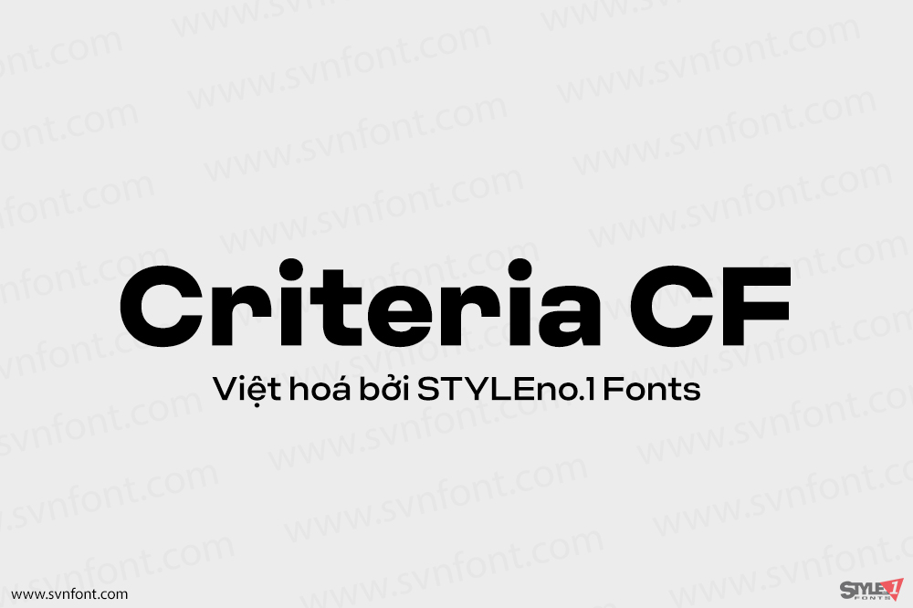
Nhà thiết kế: Christian Schwartz,Vincent Chan
Nhà phát hành: Commercial Type
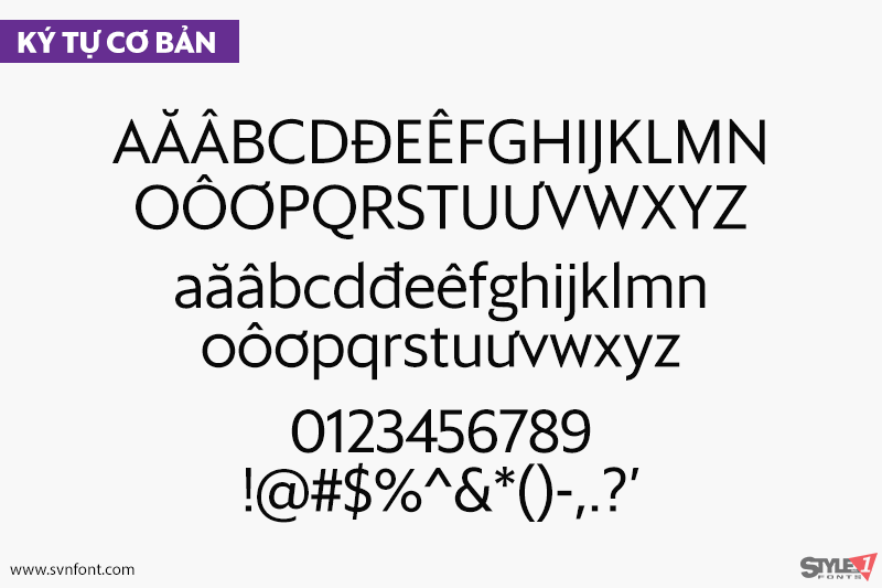
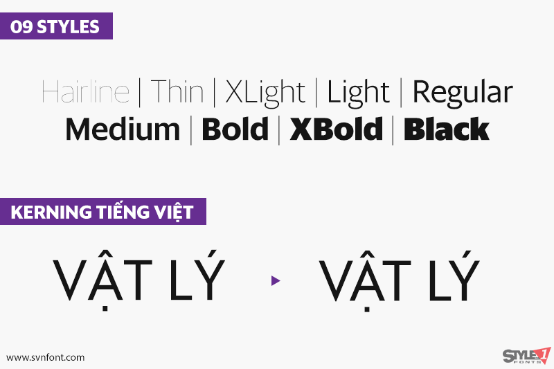
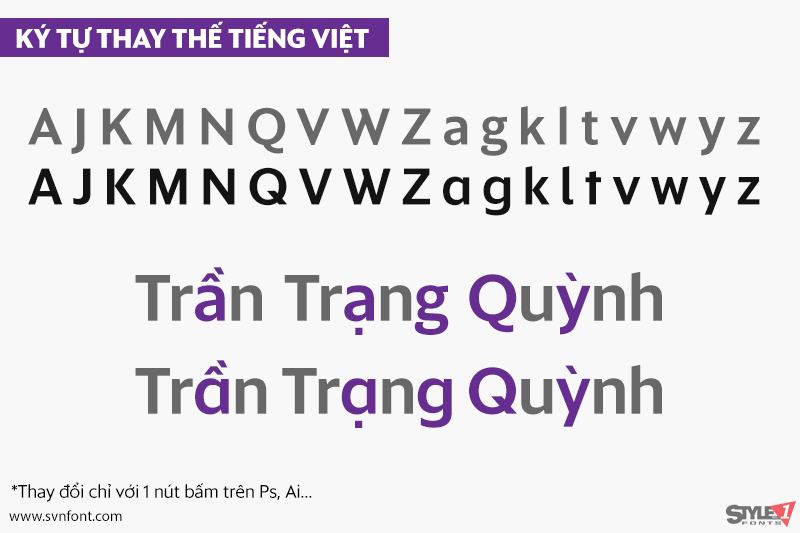
Việt hóa: STYLEno.1 Fonts
Mua bản gốc trước khi sử dụng từ Commercial Type
bản Việt hóa cung cấp cho mục đích sử dụng cá nhân dưới hình thức trả phí