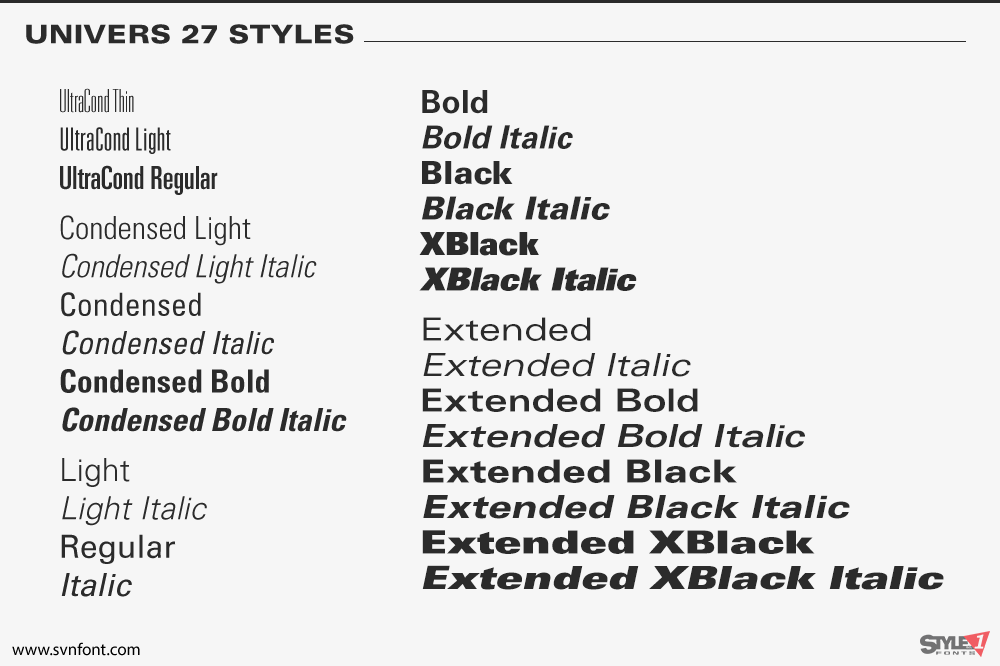
Univers was designed by Adrian Frutiger on Swiss principles for Charles Peignot at Deberny & Peignot. Frutiger imposed strict discipline across all elements of the series, from light to dark, extra condensed to extended, a concordance of design that was possible in the foundry type and photocomposition fonts. Any version may be mixed within a word with any other. It may be argued that the design of the most popular central series is limited by strict conformity to little used extremes. If Helvetica gives us the strongest central designs at some sacrifice in uniformity across the series, Univers gives us a uniform series by disciplining the central designs. Alteration of character widths required by the Monotype caster separates Monotype Univers from the original; the Linotype photocomposition version, designed by Frutiger, has a more even color across the series, achieved by relaxing the original rigid formula for stroke width. IBM Selectric Univers, designed by Frutiger, is less successful, since it had to be placed on widths tuned for Times Roman.
Nhà thiết kế: Adrian Frutiger, Aleksei Chekulaev
Nhà phát hành: Linotype
Việt hóa: STYLEno.1 Fonts
Mua bản gốc trước khi sử dụng từ Myfonts
Bản Việt hóa cung cấp cho mục đích sử dụng cá nhân dưới hình thức trả phí


![]()