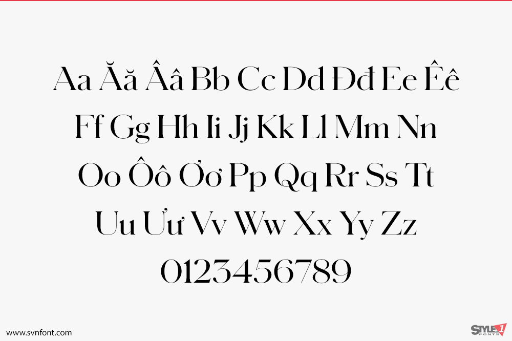
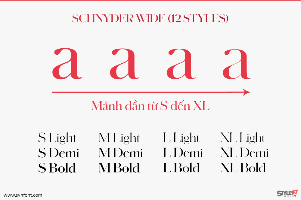
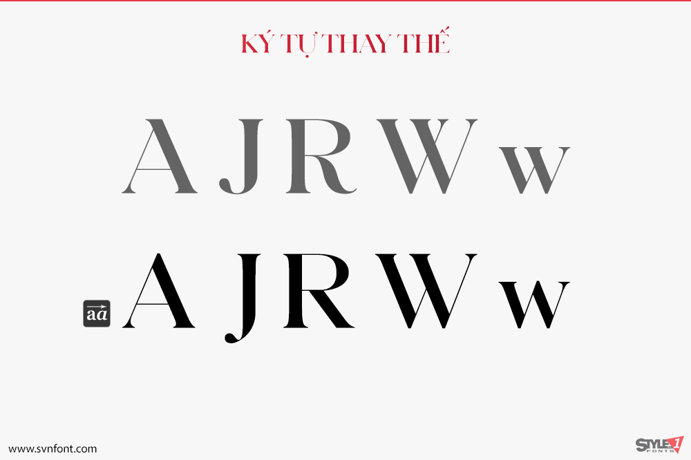
Schnyder was designed by Berton Hasebe and Christian Schwartz for the 2013 top-to-bottom redesign of T, the New York Times Style Magazine by creative director Patrick Li and his team. This typeface exists comfortably in the grey area between type and lettering, drawing inspiration from Beaux Arts-era typefaces and a piece of pointed pen lettering from Switzerland that was very precise in its thick and thin strokes, but with organic and unusual structures for invidvidual letters and great variations in character widths from line to line. Schnyder strives to embody this tension, with the high contrast typical of a fashion typeface but quirky, organic structures and a large number of alternates for many letterforms. The stem weights in each weight are identical across the widths, an unusual feature that allows the widths to be mixed freely in headlines, even within single words. With three weights, four widths, and four optical sizes, Schnyder is a complete system for making beautiful, offbeat, and distinctive headline treatments.
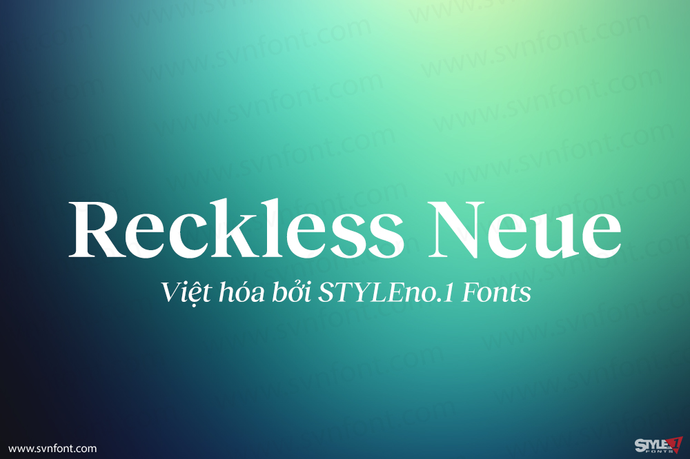
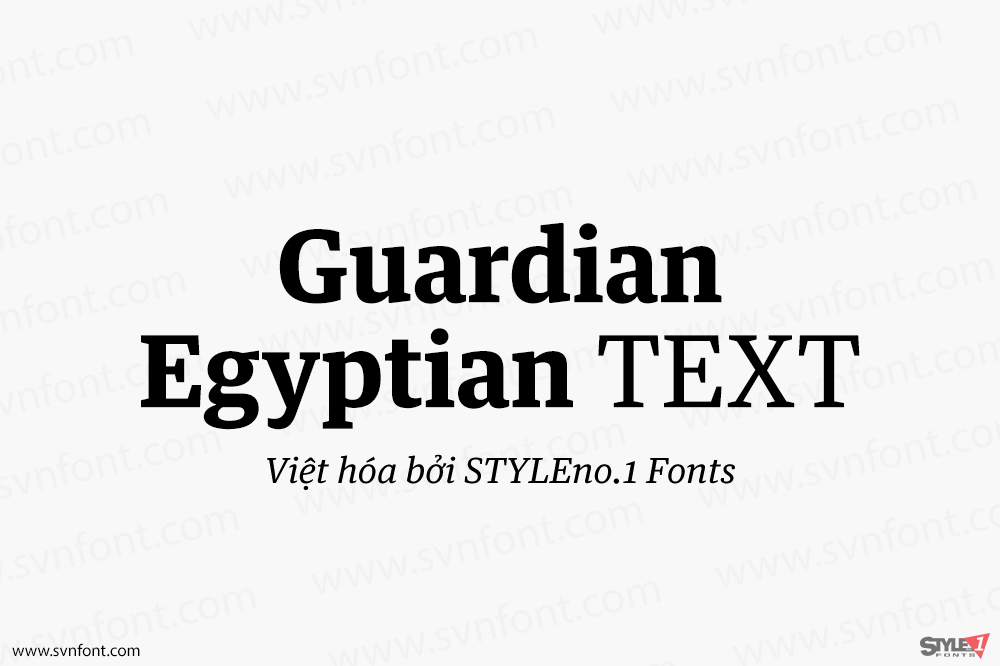
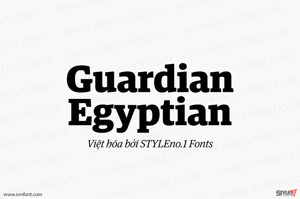
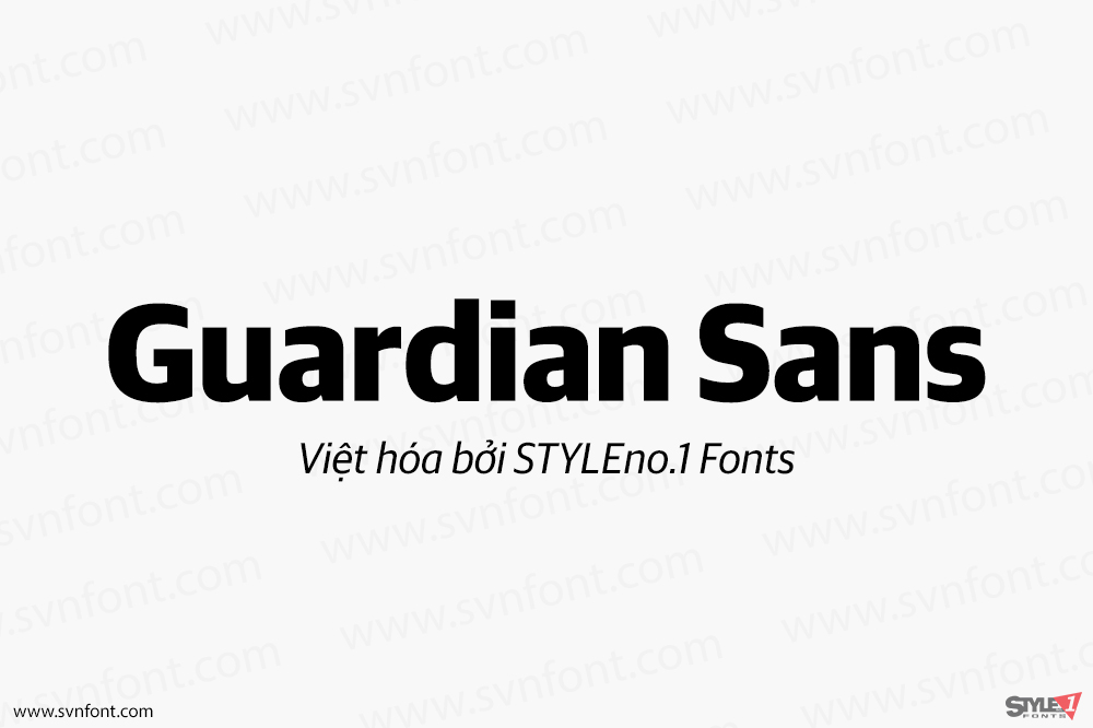
Nhà thiết kế: Christian Schwartz
Nhà phát hành: Commercial Type
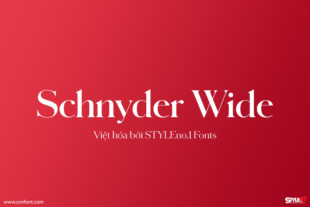
Việt hóa: STYLEno.1 Fonts
Mua bản gốc trước khi sử dụng từ Commercial Type
Bản Việt hóa cung cấp cho mục đích sử dụng cá nhân dưới hình thức trả phí.
![]()