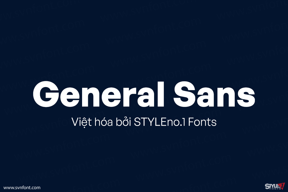
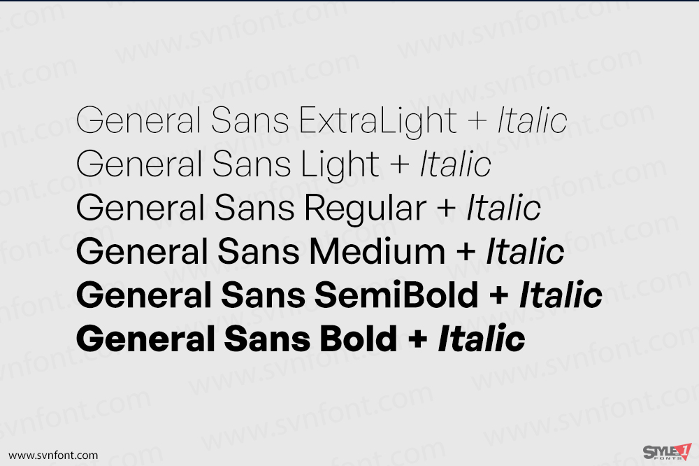
General Sans is a rationalist sans serif typeface. Its letterforms feel like the France of the 1950s; they are very orderly, but also a bit spritely. The letters’ apertures are very small, making the counter-forms in typeface feel like they are being completely enclosed within their surrounding characters. The General Sans family comes in twelve weights ranging from Extralight to Bold with complementary italics .
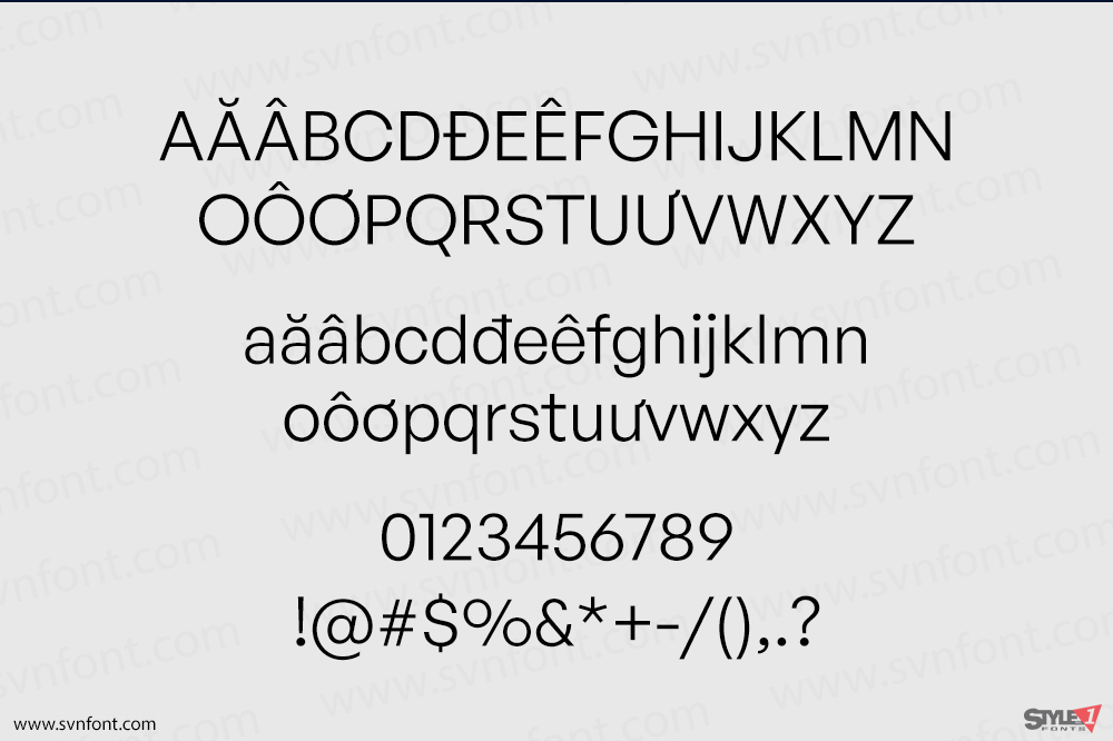
The lowercase letters’ ascenders rise up to the exact height of the tops of the capital letters. Each font has two versions for each numeral; the standard numerals are slightly smaller than that capital letters. The other numerals are substituted into all-caps text by the fonts’ case-sensitive OpenType feature. These alternate numerals are the same size as the capital letters. General Sans’s fonts also have a full range of superior and inferior numerals for the better setting of fractions. Many of General Sans’s capital letters seem very geometric. For example, the ‘G’ does not have a spur at its bottom-right, and the tail of the ‘Q’ is a simple, vertical stroke. The lowercase ‘a’ in the General Sans fonts is double-storey, while the ‘g’ is single-storey. The ‘f’ and ’t’ are very wide. The dots on the ‘i’ and ‘j’ – as well as the fonts’ dot-based punctuation and diacritical marks – are circular. General Sans is an excellent selection for use in branding, or in other kinds of corporate identity design. It may also be put to good use in editorial designs for publications about contemporary lifestyle issues.
Nhà thiết kế: Frode Helland
Nhà phát hành: Indian Type Foundry
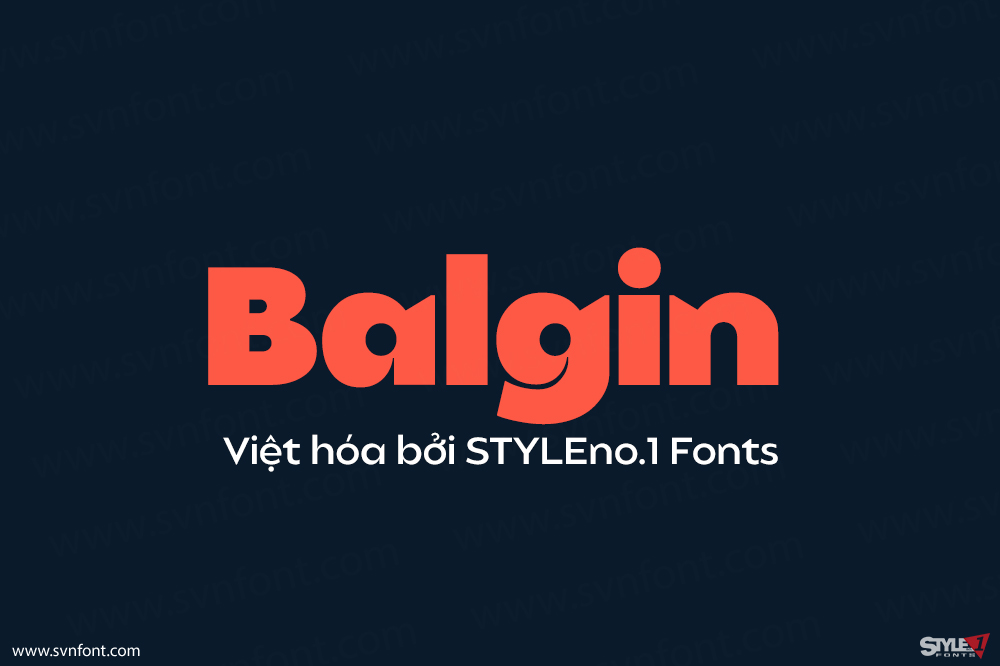
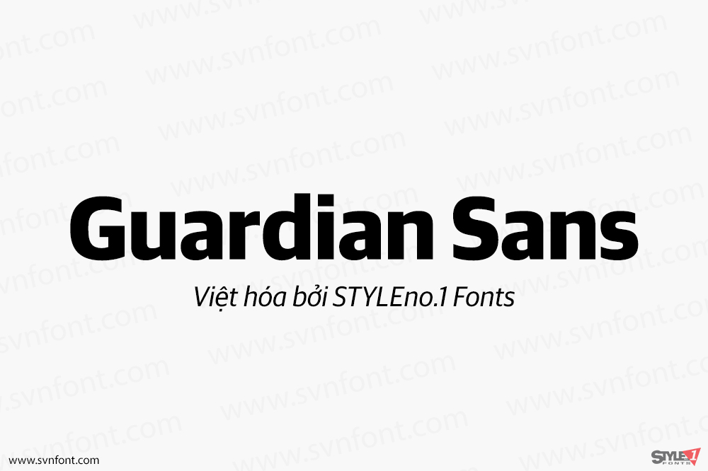
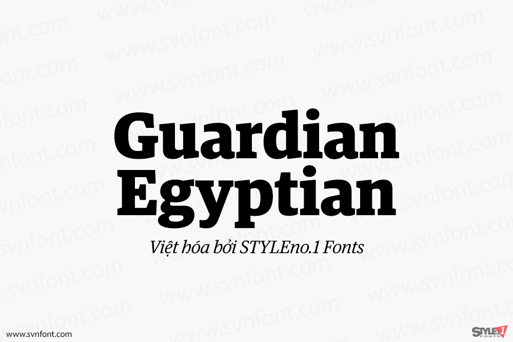
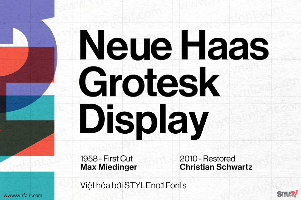
Việt hóa: STYLEno.1 Fonts
Bản gốc miễn phí cho mọi mục đích sử dụng, xem thêm
Bản Việt hóa cung cấp cho mọi mục đích sử dụng dưới hình thức trả phí.


![]()