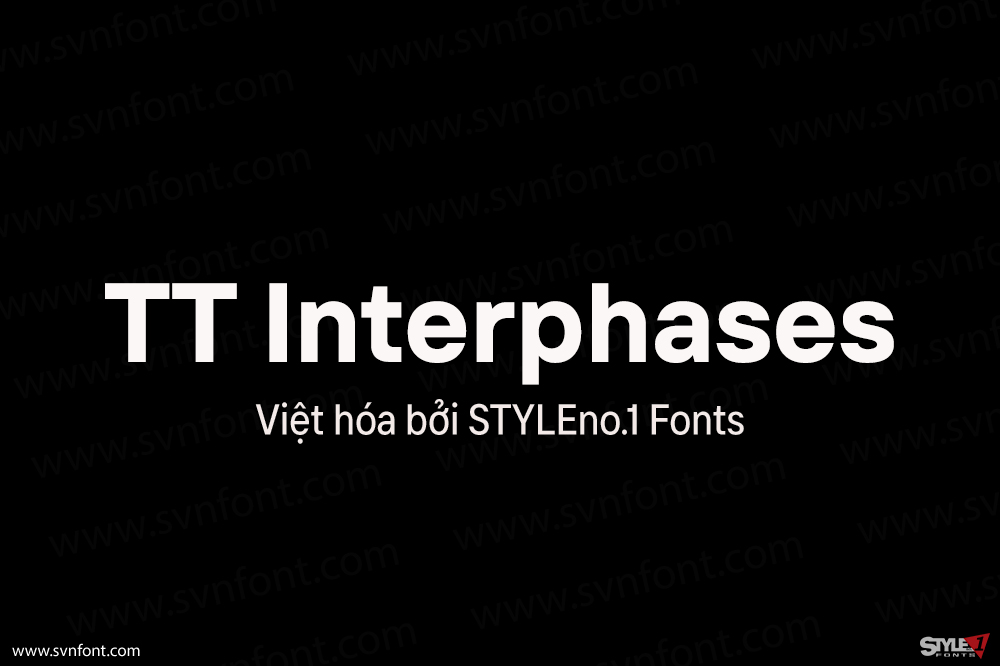
Introducing the updated interface font TT Interphases Pro!
Many are familiar with TT Interphases: convenient and modern, it was created specifically for working in interfaces. It’s time to get to know the extended version of the popular font—TT Interphases Pro, improved and even more relevant. We have preserved the neutrality and main characteristics of TT Interphases, but the new font differs from its predecessor in greater functionality and aesthetics.
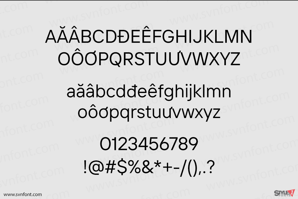
TT Interphases Pro is neo-grotesque sans serif with equal-width proportions, thanks to which the text set in the new typeface looks uniform. The tall lowercase characters improve the readability of the font on screen, while the neutral nature of the glyphs and the squared shapes of the round characters allow the font to remain readable even in small sizes. Among the visual features, users will notice smooth forms of roundings repeated in all elements, which makes large text arrays easy and pleasant to read, while closed apertures create the modern characteristic feel of the font.
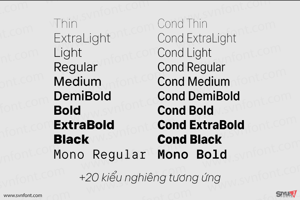
In TT Interphases Pro, designers will be able to use 2 widths at once, the already familiar standard one and Condensed, a narrow version that can be used to make text display. TT Interphases Pro has a large set of icons that visually match the characters in the font. TT Interphases Pro is the perfect font for working in interfaces on modern mobile and web platforms.
The subfamily of the more display sans TT Interphases Pro Mono with interesting glyph shapes and the same width of glyphs will also pleasantly surprise you. A monospace subfamily is suitable not only for use in coding, but also for creating design products.
Nhà thiết kế: TypeType
Nhà phát hành: TypeType
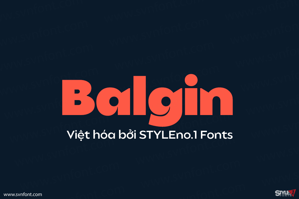
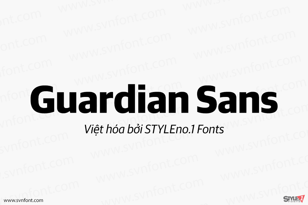
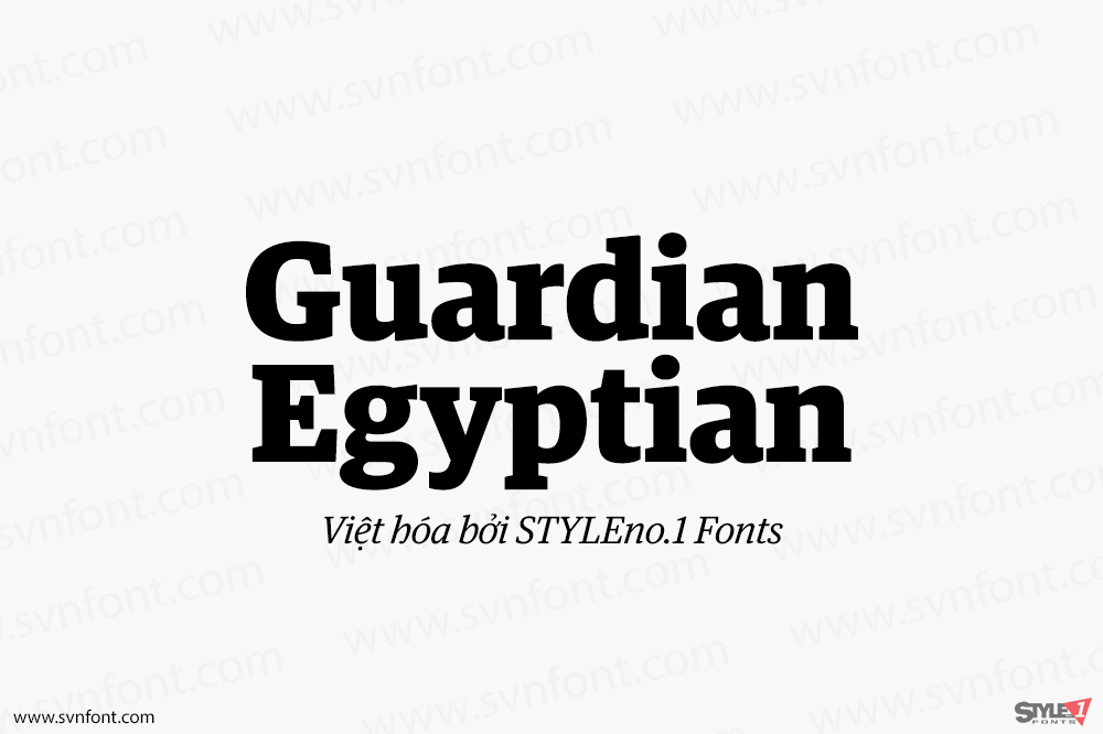
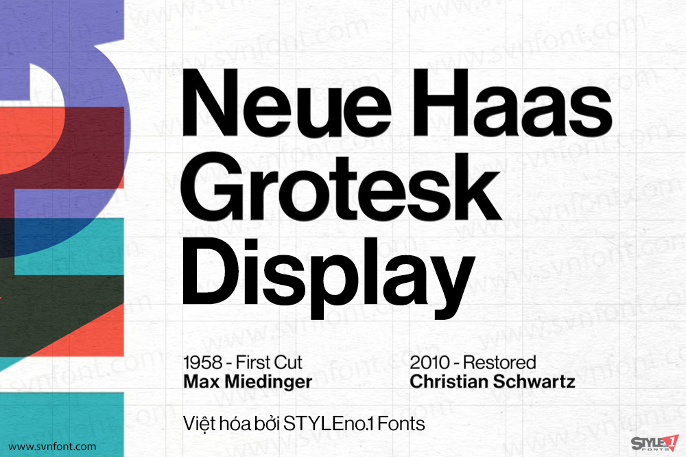
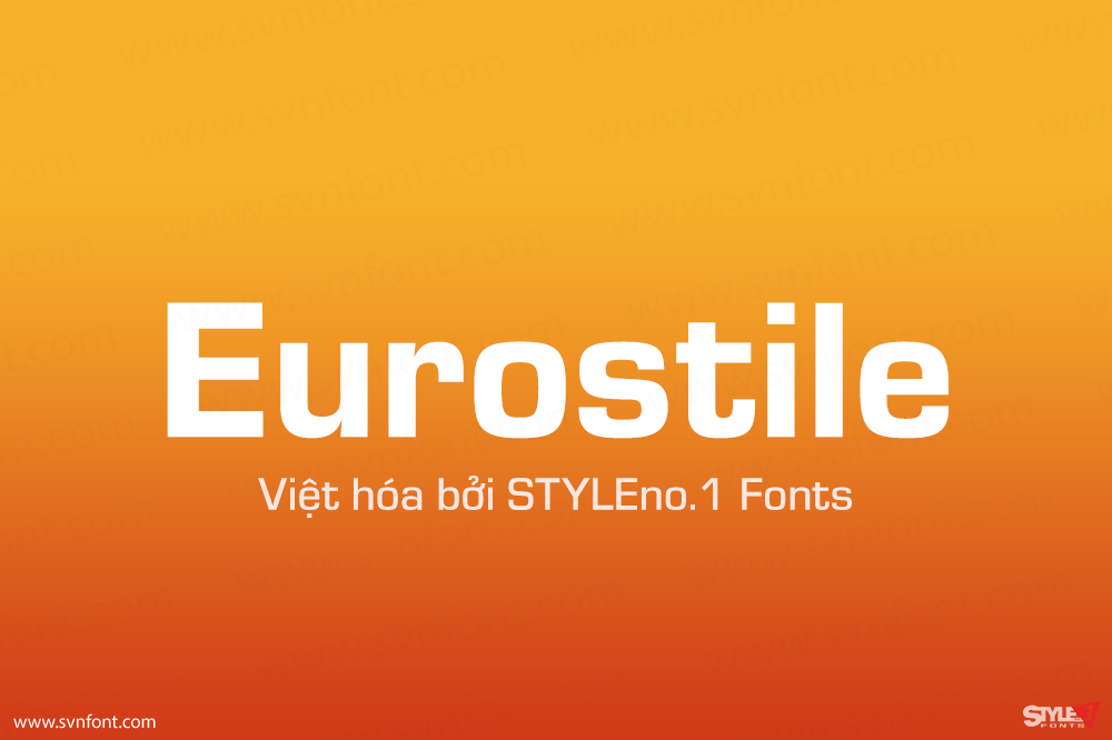
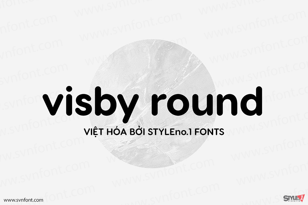
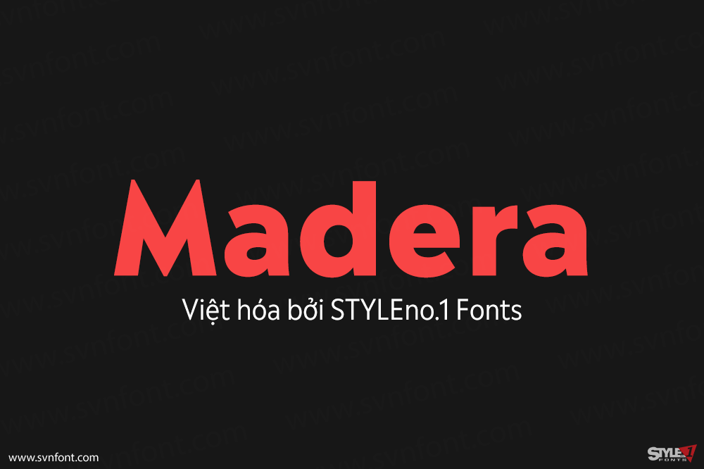
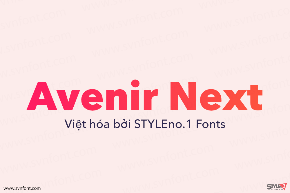
Việt hóa: STYLEno.1 Fonts
Mua bản gốc nếu sử dụng cho mục đích thương mại từ Myfonts
Bản Việt hóa cung cấp cho mục đích sử dụng cá nhân dưới hình thức trả phí.


![]()