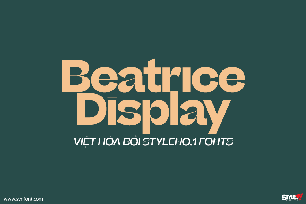
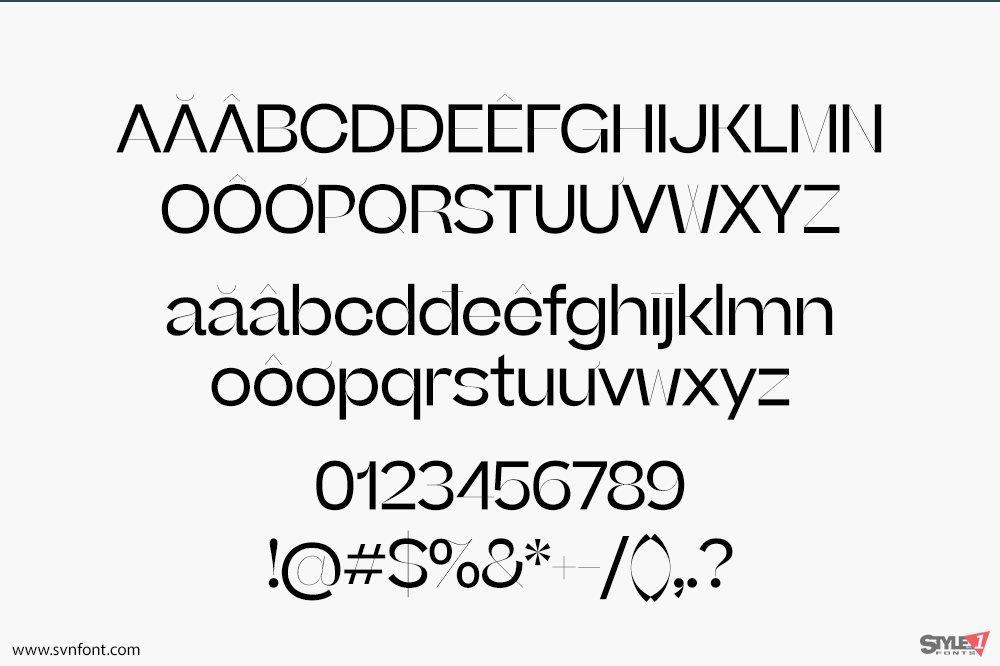
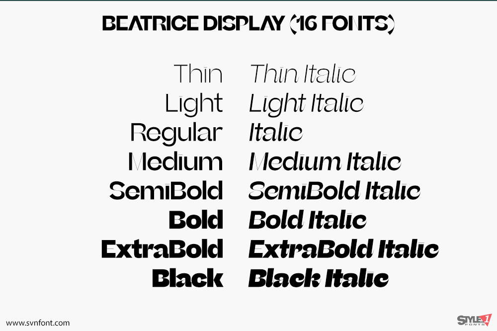
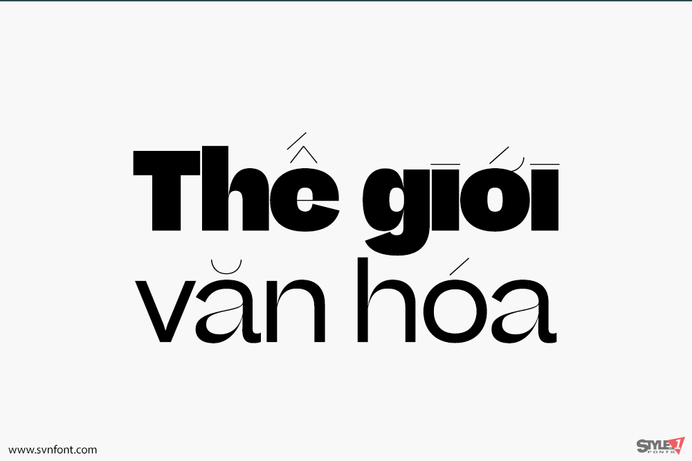
Beatrice is a new kind of typeface. The family is an exploration of contrast methodologies, combining various aspects from the canon expansionist systems, inverted contrast, and the contrast behavior of standard sans-serif grotesks. These methodologies were dissected and used as cornerstones in building our own system, with the final result landing largely in unexplored territory. Built on the foundation of a traditional American Gothic but with tight-as-can-be spacing, the superfamily spans a robust set of weights and includes 2 optical sizes: a super high-contrast, tightly packed Display cut, as well as a standard low-contrast cut, designed to function beautifully in a wide range of optical sizes.
Nhà thiết kế: Lucas Sharp, Connor Davenport
Nhà phát hành: SharpType
Việt hóa: STYLEno.1 Fonts
Mua bản gốc trước khi sử dụng từ ShapType
Bản Việt hóa cung cấp cho mục đích sử dụng cá nhân dưới hình thức trả prí.
![]()
Xem thêm: SVN-Beatrice (14 fonts)